STTC's parent company needed a website built to showcase their new testing facility. It needed to be clean and easy to navigate and read for any perspective companies looking for a facility to test their new innovations in.
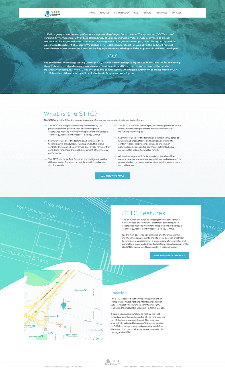
On the homepage they're greeted with a video of some running water and an opening blurb about the history and idea behind their facility, and beyond that even more information and call to actions to other areas of the site that may be most important to the visitor.

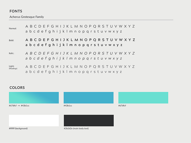
The colors and design elements used help to invoke pristine water while also being soothing, helping ease the eye while perusing dense information.

Facility
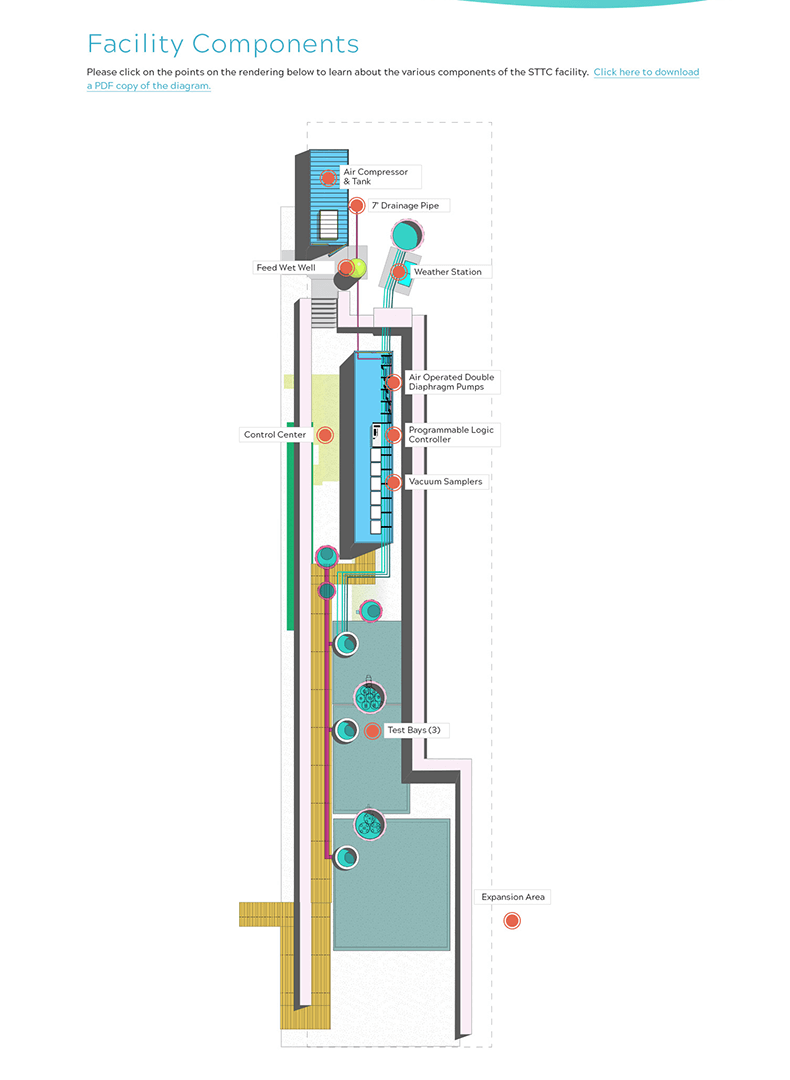
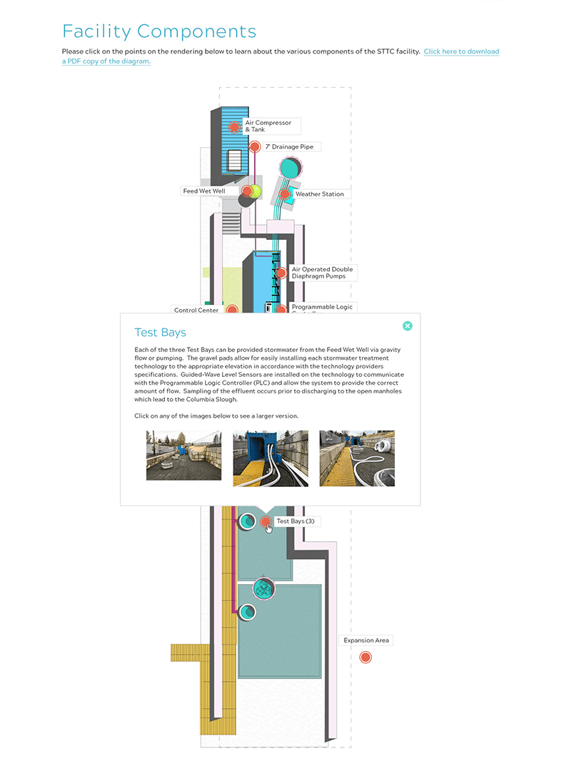
The main draw they wanted for the site was a means to explore the facility within their budget. I proposed a fairly simple points of interest map that works on both desktop and mobile, where the dots highlight the more important areas of the facility and, when clicked or tapped, an information box opens with copy and images.


Interiors
Interior elements were designed to invoke the idea of blueprints, a sight motif throughout the site's design, with multiple thin lines that contain information or direct your eye.


