Broan-Nutone came to us wanting a full website refresh. They felt their site was feeling dated, empty and not as cohesive as it could be.
I tackled it with a few things in mind. It should have a familiarity to other hardware e-commerce stores, but be more polished and clean, giving it a friendly and slightly upscale atmosphere.

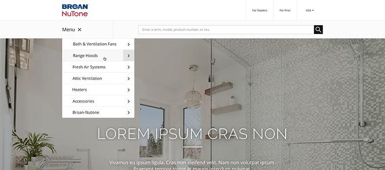
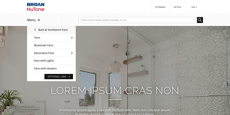
Menu
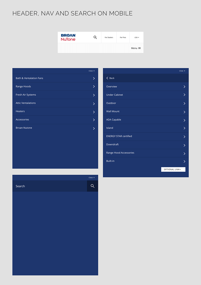
The menu is very simple, gearing users straight into the products. It uses a sliding panel effect that shifts between menu levels in the same plane.
Product Details
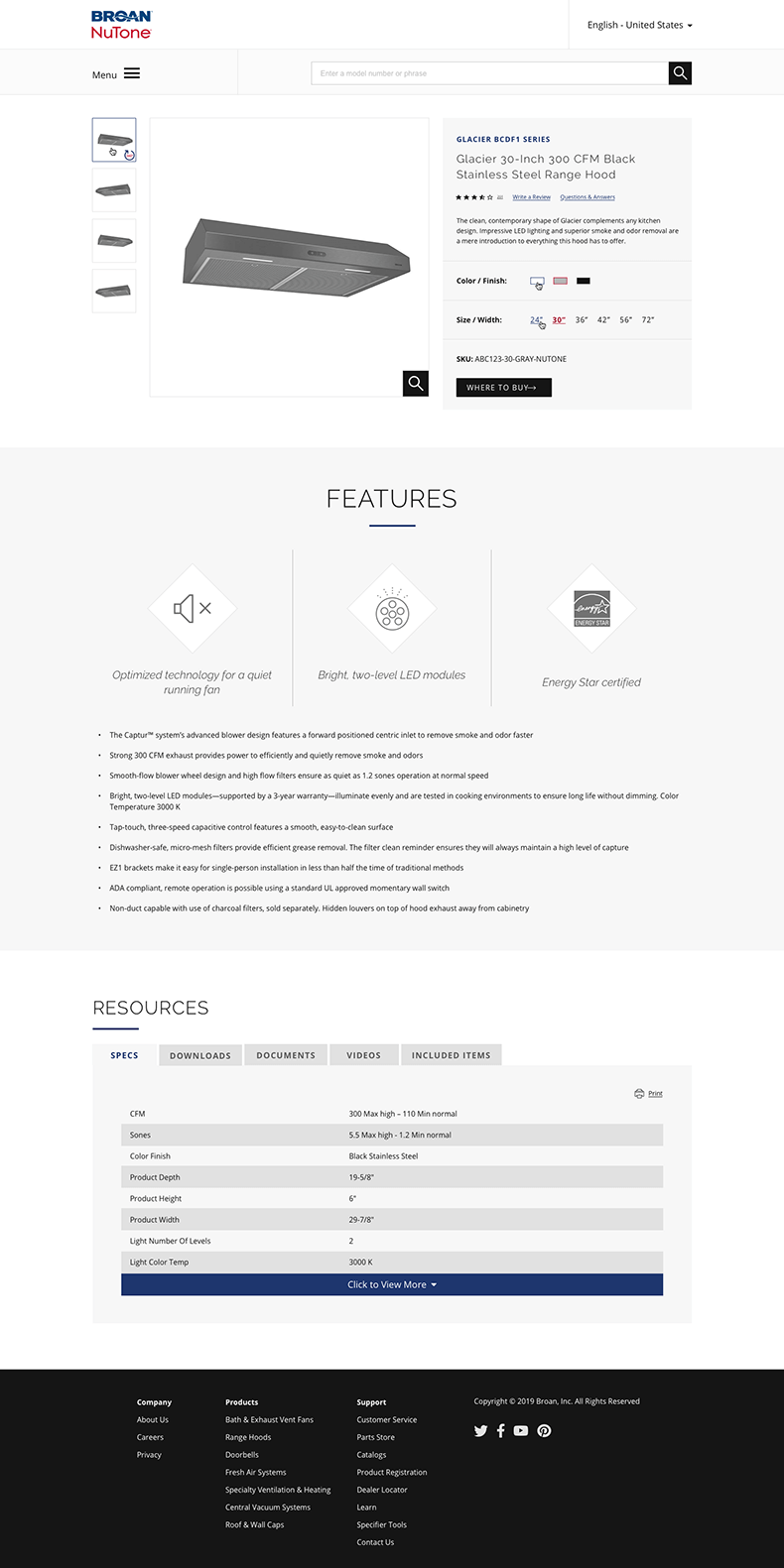
The product details page is clean and simple, quick to find the important information of the product for both professionals and home DIYers alike.
Search and Compare
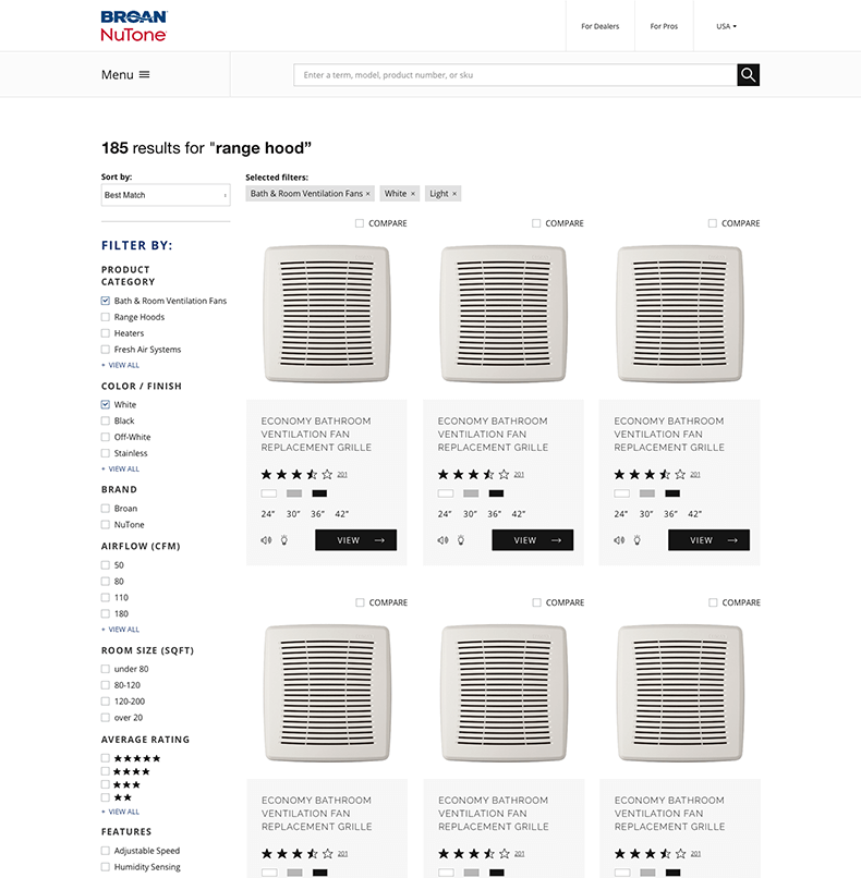
The search results page can be narrows down via various filterable options, and includes an option to select up to four items to compare.
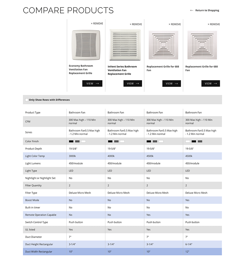
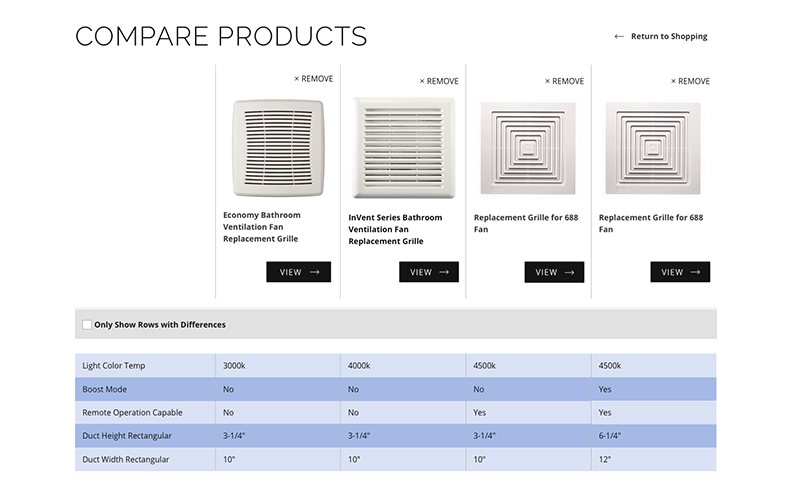
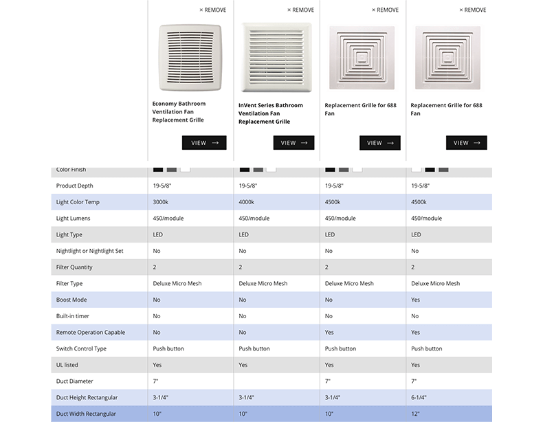
The compare page shows the information of each product in a table, with a floating header of the 4 items that scroll with the user so they don't lose track of which column belongs to which product.
It includes an option to view only the rows with differences for quick perusal.
Components
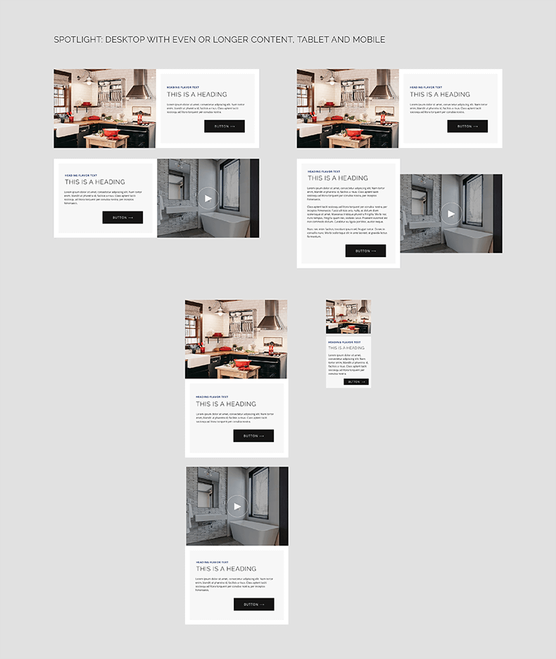
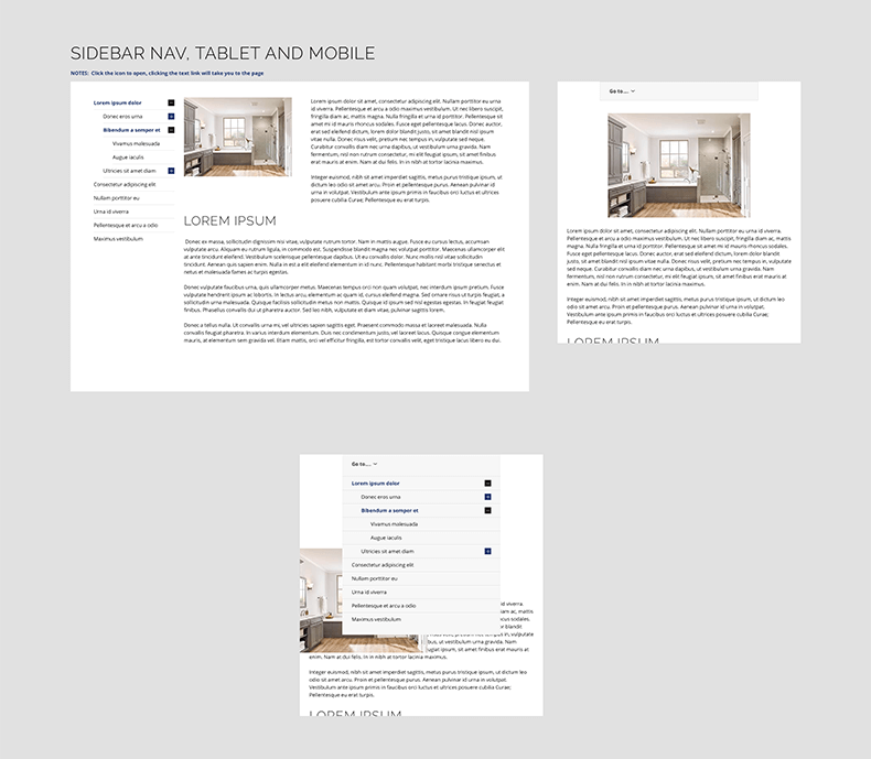
The company designs and builds the with modularity in mind, so that most components can be placed somewhere and function. I created many states for many of the components as guides for any of the devs that may work on it.
