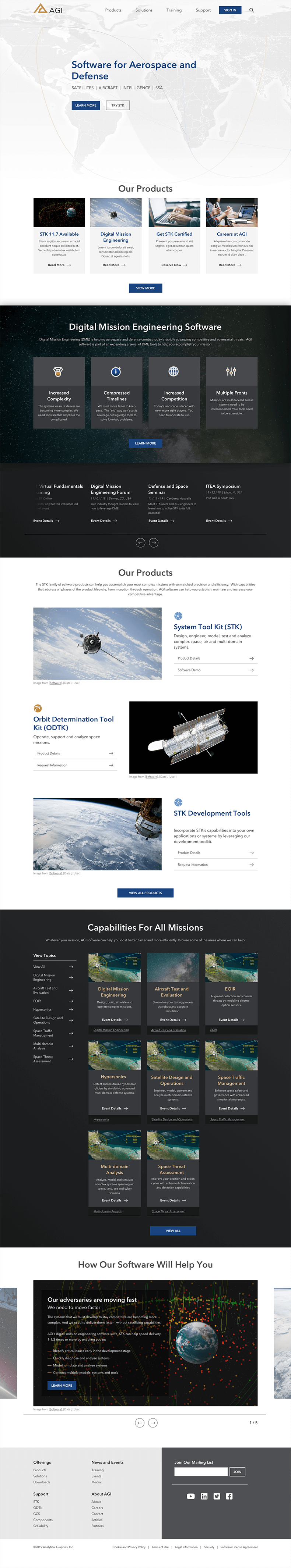
AGI came to us needing a website refresh. They felt their current site was too cluttered and a little too on the nose with all the in-your-face space motifs. They wanted something cleaner, whiter (but not too white that it looked empty or unfinished), and easier to find their products, especially their more prominent ones.
Hero
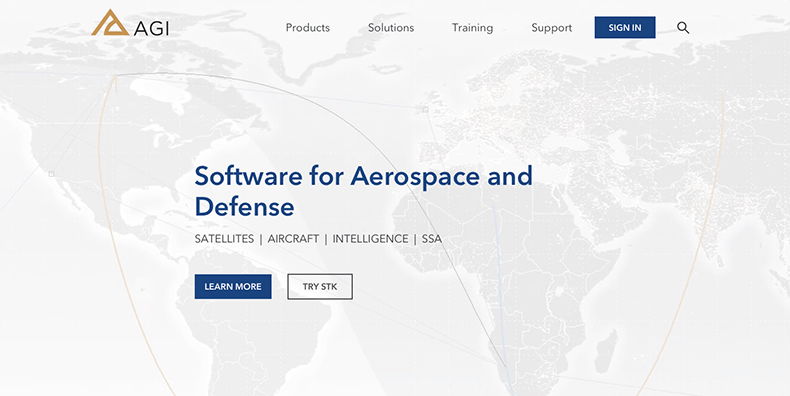
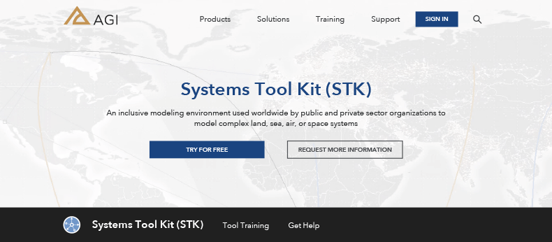
They wanted a "wow" factor to open with. I pitched a webGL or video in the hero; they provided some video from one of their products. I wanted something subtle that it wouldn't overwhelm the message or the info ovrlayed on it, but still with movement enough it caught the eye. It follows the user through the site in a more condensed header space on interior pages.
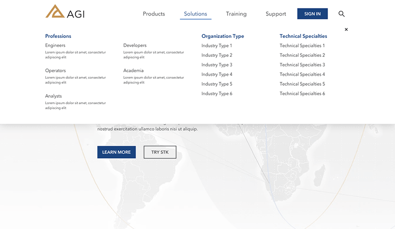
Mega Menus
Built to open on click with quick links to their more important products and info.

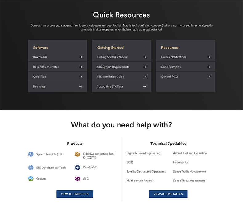
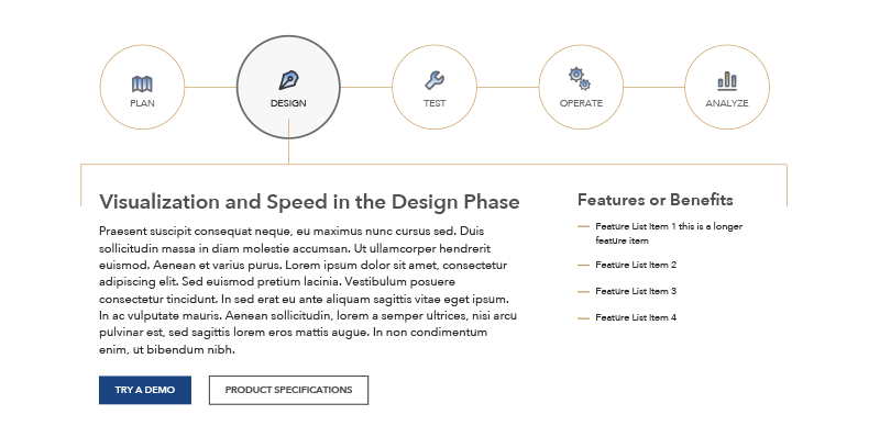
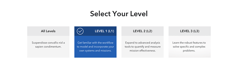
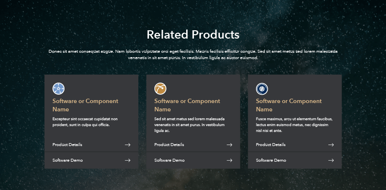
Components
The site was designed and built with modular components in mind. They can be used anywhere throughout the site and be able to flow together. Any space immagery is included in product images themselves or as subtle backgrounds on darker components to break up monotomy.