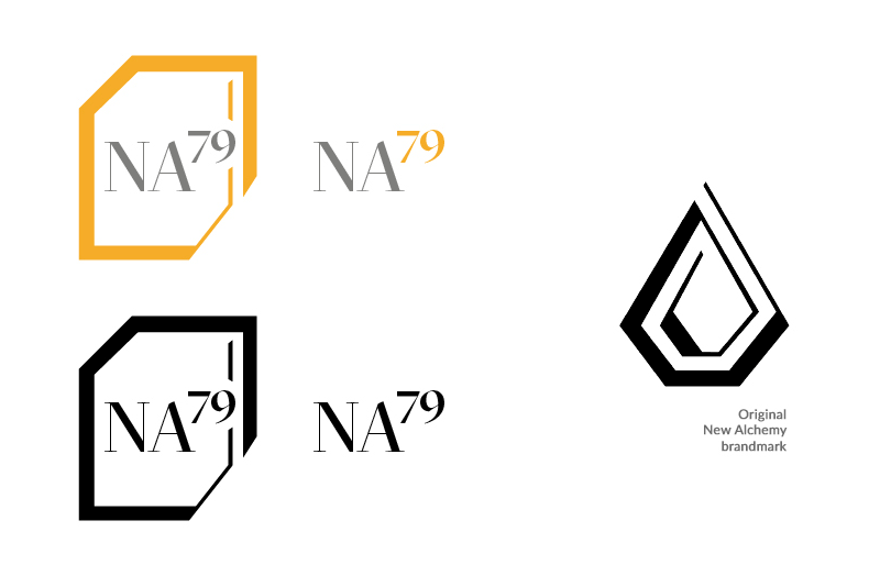
New Alchemy needed a quick landing page for their community events and a logo for this aspect of their business.
The logo takes inspiration from a typical design of a cell from a periodic table of elements while harkening back to the original business logo with certain design elements.

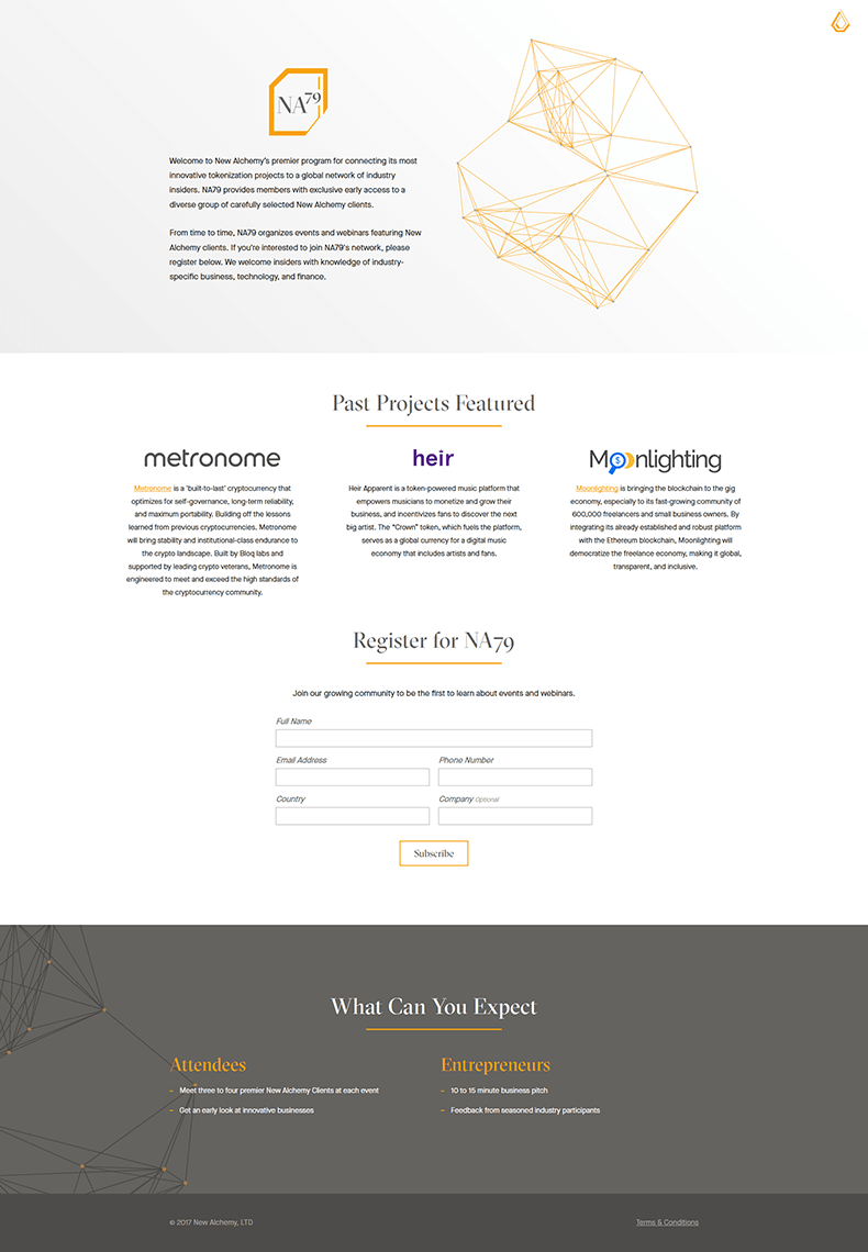
Landing page
The landing page was a very simple affair, clean and quick to read as a user, letting the content do the talking. As a user scrolled it had simple animations of elements lifting in slightly and growing horizontal yellow lines.

