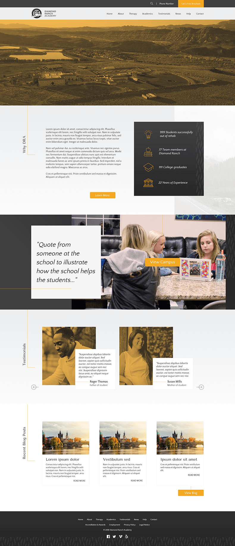
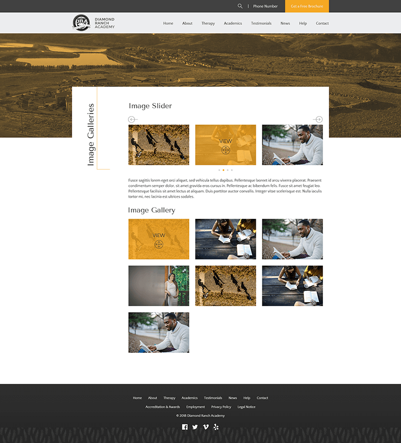
DRA needed a refresh to their website, which was riddled with broken elements, off-brand colors and distorted images. We pitched to them a clean but distinguished website.
The client specified their colors as black, white and gold, for a prestigous academy to help youths who may be struggling in their abilities to graduate school. For the homepage, the full width banner will be a HQ video of the property, adjusted to be duotone, bringing another layer of interest.

Interiors
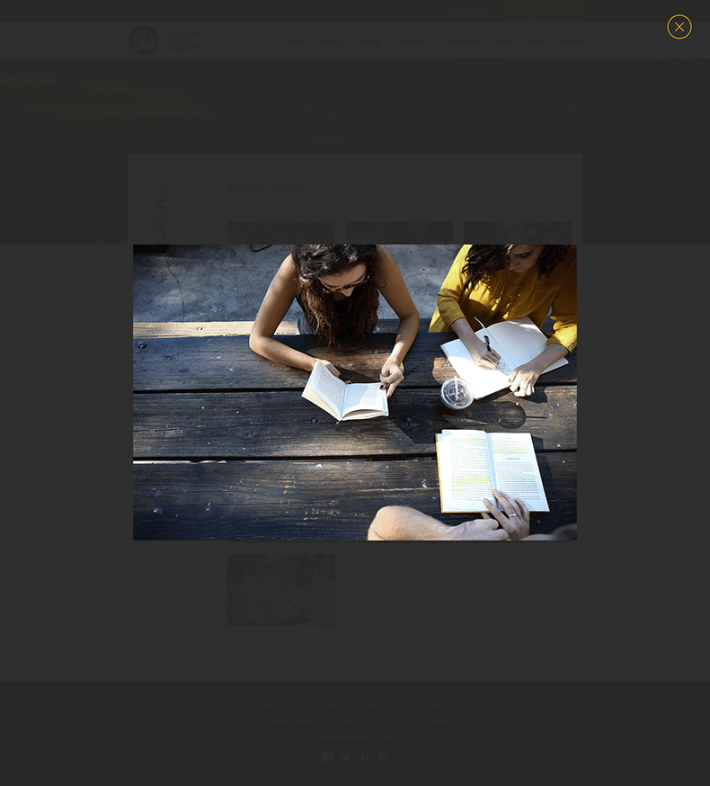
I wanted the site to be readable while still interesting, incorporating some subtle gradients and textures, overlapping elements and vertical headings with thin lines to help with this goal. Bold colors on hover help keep a visual interest without it being too overwhelming.


